
Mapping Computer and Internet Use by State: Introducing Data Explorer 2.0
One of the major advantages of NTIA’s surveys on computer and Internet use stems from their very large sample size—approximately 53,000 households representing more than 120,000 people. This allows us to break out results by demographics like age, race, income, and education, as well as by state of residence. Today, we are launching a new feature of our Data Explorer tool enabling users to visualize NTIA’s computer and Internet use data by state, with metrics displayed in a national map.
Figure 1: Internet Use from Any Location by State
Percent of Americans Ages 3+, 1998 & 2015
December 1998 July 2015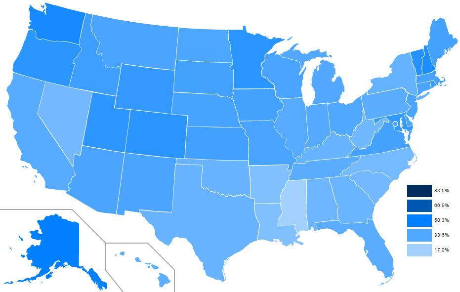
Users can easily adjust the map to reflect different datasets, while pressing the “Play” button cycles through datasets to show how the country has changed over time. The map view is available for every metric in Data Explorer, such as use of various devices, locations of Internet use, and online activities.
Breaking out data by state reveals interesting details about the evolution of Internet use across the United States. For example, while Internet use increased in every corner of the country over the last two decades, many of the states that led the nation in 1998—such as Maryland, Minnesota, New Hampshire, and Utah—continued to have some of the highest adoption rates in 2015. At the same time, some states that historically lagged behind have seen relatively large gains over time. While only 27 percent of Nevadans used the Internet in 1998, compared with 41 percent of their neighbors in Utah, the gap between the two states has narrowed significantly in recent years, as an estimated 78 percent of Nevadans and 81 percent of Utahans used the Internet in 2015. Despite this rapid growth, some states continue to trail. In 1998, only 17 percent of Mississippi residents used the Internet, compared with 33 percent of the country as a whole. The Magnolia State made dramatic gains by 2015, when Internet use stood at 70 percent—just five percentage points less than the national figure—but it continued to have one of the lowest adoption rates in the country.
Data Explorer’s new mapping function can also be used to show how location-based services have proliferated in a short period of time. In 2015, 71 percent of American Internet users ages 15 and older used location-based services, including maps, reviews of nearby restaurants, and other applications that rely on GPS or other methods of geolocation. This is a big jump from 2013, when just 39 percent reported this type of activity. The state-by-state map shows that, while there are some considerable variations between different parts of the country, use of location-based services has grown quickly in every state. In Montana, for example, Internet users taking advantage of location-based services surged from 27 percent in 2013 to 67 percent in 2015. And in Illinois, this activity grew from 40 percent to 74 percent.
Finally, state maps reveal the rapid, but uneven, growth of smart TVs and TV-connected devices (e.g., Roku or Apple TV) over the last few years. Nationally, use of this type of device nearly doubled from 14 percent of Americans in 2011 to 27 percent in 2015. But some states, particularly those in the western half of the country, adopted these devices more quickly than others. Washington state, for example, has adopted TV-connected devices more quickly than the national average, with 19 percent of Washingtonians using such devices in 2011 and 35 percent in 2015. In contrast, only 9 percent of Alabamians used TV-connected devices in 2011, and adoption in that state increased to 16 percent in 2015.
In addition to the mapping feature, we’ve made several other enhancements to Data Explorer. Users can now save, bookmark, and share links to specific charts (for example, social network use by age group), rather than having to re-select the metrics and breakouts of interest on every visit. Other improvements include a reorganized metrics menu, a widescreen format, and minor interface enhancements.
NTIA has received lots of helpful feedback since Data Central and the Data Explorer tool launched one year ago, and we hope these new features enable researchers and the public at large to make even better use of our data. How else can we help? Let us know at [email protected].
Interested in learning more about NTIA’s data? Sign up for the Data Central mailing list to get the latest news in your inbox.